Sankey Chart
Sankey chart is useufl to visualize the flow of money between different categories and time periods. It helps you understand where your money is coming from and where it is going, making it easier to identify spending patterns and optimize your budget.
Fina provides a powerful Sankey Chart feature to help you visualize the flow of your finances over time. It is located in the Categorization page, turned on or off by a simple toggle switch.
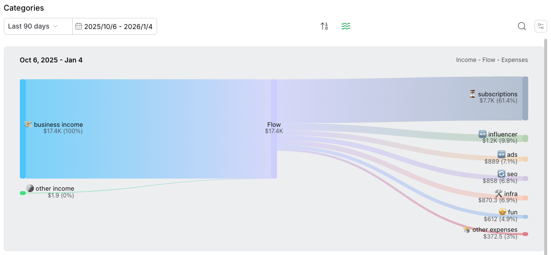
When the Sankey Chart is enabled, you will see a dynamic flow chart that illustrates how money moves between different categories, accounts, and time periods.
To open a sankey chart: go to categorization page -> click the "waves" icon to toggle it on / off. You can change the time range using the date picker to view the flow chart for different time range.