Turning Tracking Into Interactive Experience Trough Bubble Charts

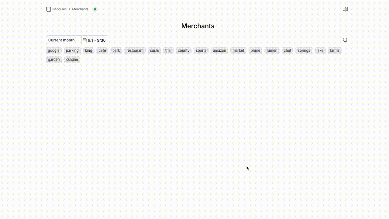
I was scrolling through the list of merchants in Fina Money — it felt plain and, honestly, a little boring.
- No colors.
- No sense of which ones are big or small.
- No context for how often I spend there.
But why should finance apps be just numbers and dollar signs?
At Columns, we’ve created plenty of beautiful, fine-tuned graphics. So why not bring that same energy into Fina with data visualization?
One of the simplest, most intuitive options is a bubble chart:
- Add colors to distinguish different merchants
- Use bubble size to show spending volume
- Even add playful bounce animations when bubbles pack together
Suddenly, tracking spending goes from bland to fun, bringing your financial world to life in a single view.
In fact, more entities can be visualized this way, such as:
- Categories
- Tags
- Accounts
I think it is great application of a bubble chart, what do you think?
If you haven't experienced it yet, sign in to your Fina account and check it out in the Merchants module. Once you landed on the merchants module, you can click on any bubble to rename the merchant or view all transactions for that merchant.